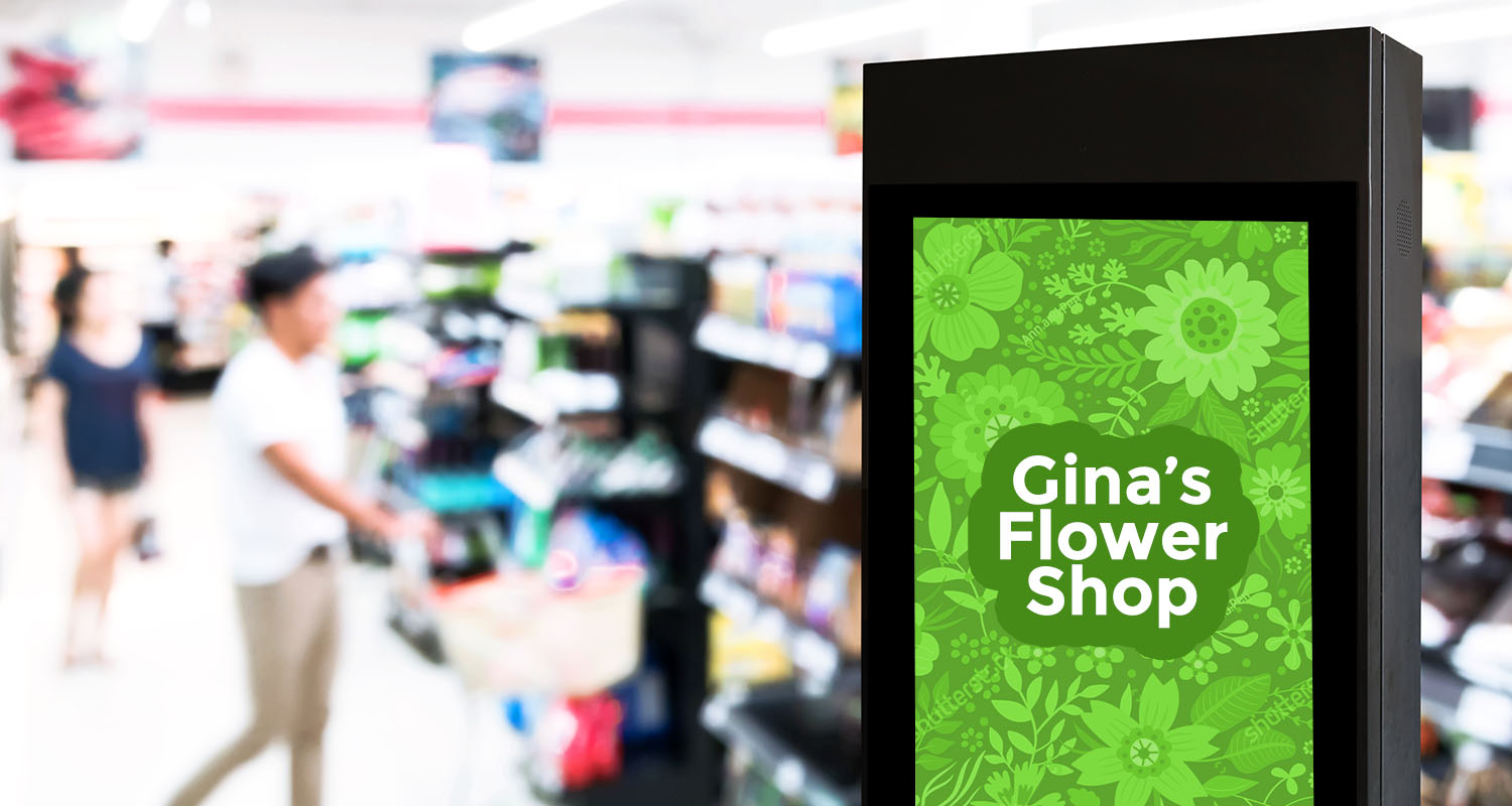
First in a series…
Advertising media comes in many shapes and sizes – print, video, radio, banner ads, OOH and more. Once you’ve decided who your audience is and what their media consumption habits are, and have decided your media of choice, the next step is creating captivating, engaging content that once exposed to your ad…your audience will read your message!
However, it’s more than just finding the right media for your audience, it’s understanding the media, and where and how your audience is interacting with it to help determine ‘what to say’ and ‘how to say it’.
While the agency account teams and brand managers write and re-write creative briefs, once it gets into the hands of the designer, that’s when the words come to life. Remember though that ad design that works in print may not translate well to video or to out-of-home. Each media vehicle has its own nuance.
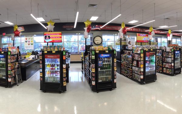
Adcorp offers out-of-home, in-store supermarket advertising media programs to our customers, and have been doing so for over 10 years. It’s our ‘thing’, and like the old KFC jingle…’We do OOH right’.
Not only are our out-of-home print and digital in-store programs effective, targeted advertising vehicles, we also have a design team that knows this medium and what works best in terms of effective, engaging design and have worked, successfully (read: patiently) with our customers to help them understand what design techniques work best.
This blog is a first in a series of tips compiled from our strategists and designers to help other designers and clients using this medium to understand the best approach and design aspects for out-of-home advertising.
First, let’s start with Strategy…
Tips For Developing a Great OOH Creative Strategy
More often than not, out-of-home media serves as a branding tool to generate awareness of your brand, and what it stands for.
That said, here’s what you need to know to make your ad effective and engaging.

Think about your business
Identify your strengths and let them shine! Think about your business in a more abstract way. It may help to try to view your business from the point of view of your customers/clients. What is it about your business that makes your clients choose you? What makes you different from the competition in your area? How do you want customers to feel about your business after they view your ad – what’s the ONE THING you’d like them to remember about your business.

Think about the space
OOH advertisements are everywhere, and we engage with more ads out of our home than ever before! Where will your ad be featured? Is it a static print ad or a video/motion graphic? Think about where your ad will be and try to connect to the people passing it. Visit the location where your ad will be featured. How will your target be engaging with your ad.

Focus on a single message
Choose one main point that you would like to convey to your audience and stick to it. Focus on the one thing that makes your business stand out from the competition and shows the end benefit of choosing you, specifically. The benefit of your service may be the same as your competitor so think about the end-end benefit that is unique to you, something that may garner an emotional response (trust, safety, experience) vs. price, customer service, etc. The ad itself is to get them interested in you and to show how you differ. Make the message relevant to them.

Keep it simple – Less is more
It is most effective in this medium to keep the information about your business ‘short and sweet’ and to the point. Try not to be too clever or funny. If it takes too long for your audience to figure out what you are saying, you’ll lose them. Too many messages will only confuse a viewer and may end up ultimately taking away from your message rather than adding to it. It is important to keep it focused on that one central message. Since OOH media typically serves as a branding tool, steer away from elaborate messages and KISS ‘Keep It Simple, Stupid.’
So, embrace the thoughtful artistry of a simple design. OOH is not like standard print advertising which gives the user time to read the ad and digest the message. Typically OOH ads are placed in hi-traffic areas so the simple message repetition is what will build the branding message.
Remember, you only have a few seconds to capture a potential customer’s attention and an engaging, stunning image will capture their attention, and a concise, simple message will register your business name, and the benefit of your service. A clean, simple ad can do all those things at once.
Next in our series of ‘Design Tips for Effective OOH Advertising’ our designers will address the specifics of ad creation.


